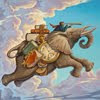
Thursday, September 30, 2010

Friend cover Progress


Here's progress on the Friend cover I am working on. I decided to go with a tight full value drawing before I start to play with the Photoshop brushes. I then scanned it in and began adding color. To start with, I am keeping the drawing on it's own multiply layer but I'll flatten the layers pretty soon and paint on top. I had to lose the kid in the dinosaur costume (editorial decision) and I am disappointed, but I still like how it's going so far. The color scheme is based on old circus posters. Hopefully I'll get more comfortable with the brush options as I go along.

Wednesday, September 29, 2010

Originality and Big Art


I am teaching  Illustration 488 at BYU this semester. It is the business practices class for the seniors in illustration. Inevitably the idea of style arises and the next question someone always asks how do you find your own style. My answer to this is that you don't find your style, IT FINDS YOU. Brad Holland, one of the finest illustrators currently working summed up his search for his style by saying that the more he looked for it, the harder it was to find, but when he quit looking, he found it. Have a look at this very insightful short film about Brad Holland's work. 

Below are two of my favorite quotes dealing with this issue:


"Even in literature and art, no man who bothers about originality will ever be original: whereas if you simply try to tell the truth (without caring twopence how often it has been told before) you will, nine times out of ten, become original without ever having noticed it.
 -C. S. Lewis


“Big art is the process of elimination. Cut down and out- do your hardest work outside the picture, and let your audience take away something to think about, to imagine.”
-Frederic Remington

Our style is a culmination of all we are about artistically. It is the summation of all life's experiences combined with how we draw and how we see and think. Just draw and draw and respond to what comes out. That will be your style.


Tuesday, September 28, 2010

Pumpkin Themed Signing

The color of the truck was changed in Photoshop from red to blue.

The last two days postings reminded me that when I did the first Prize Pumpkin cover, I got to fly back to Chicago for the ABA, national bookseller convention. I was thrilled as they themed the entire Pearson display around the art from my cover.

There's my cover-front and center on the bed of the truck

As you can see from the photos, they got a truck that was about the same age as the one I painted in the picture and filled it with farm related paraphernalia as well as large copies of the various book covers. I signed copies of the textbook sporting my artwork for all the potential buyers that showed up. It was an enormously fun opportunity. I spent the rest of the afternoon at the Chicago Art Institute- which was also pretty cool.

Monday, September 27, 2010

Prize Pumpkin-The Sequel

Prize Pumpkin-Part 2 14" x 19" Acrylic
By Greg Newbold

So after Farmer Dixon wins first prize in the ridiculously gigantic pumpkin growing contest, he has to figure out what to do with his monumental gourd. He rigs up a rope contraption and a steam shovel to lift it and  bargains with the local bakery to swap him. The trade for the hefty squash nets him some serious pies. Don't ask me how he got the thing loaded in the first place, but it took the crane to get it off. This painting was a fun exercise in narrative storytelling as I took the scenario that I came up with in the first cover and extended it to what happens after. This one was also a Reading Street textbook cover for Pearson/Scott Foresman.

Friday, September 24, 2010

I. F. - Old Fashioned

Prize Pumpkin - Acrylic, 13" x 18" (approx.)
by Greg Newbold

Farmer Dixon here has loaded up his classic pickup truck and is heading out to a good old fashioned pumpkin growing contest. Something tells me he's going to win...if he can make it over that hill. This painting was done a few years back for Pearson/Scott Foresman as a reading textbook cover. It spawned a sequel which I'll post on Monday. On the other hand, my pumpkin vine was pretty pathetic and spawned only two soccer ball sized gourds this year. there's always next year.

Thursday, September 23, 2010

Grasshopper Final Drawings


I had to put this project for Boys' Life aside while I worked on a couple of other things, but I am now ready to get painting. I posted the rough thumbnail of the first one earlier and the final drawing of the third spot piece also. The second piece shown here is the climactic shooting challenge where young Crazy Horse shoots a gold coin out of the air with his bow and arrow. Of course his older, rifle wielding challenger is thoroughly dismayed. It took me a few days to line up the right age and build of model for my photo reference but I really got some good shots. Obviously, liberties were taken with the skin tones and the hair (my model is a blond haired white kid), but I got all the information I need for anatomy and lighting. I am excited to get on to the painting phase now.

Wednesday, September 22, 2010

Friend Cover Sketch

The approved cover concept sketch-
graphite with digital tone added

I am working on a cover project for the Friend magazine and I have decided to create the art from start to finish in Photoshop using mainly the paint tools. I have done a few things this way, but mostly I have used Photoshop to work out my compositions and do digital under paintings which I then paint over traditionally. I rarely carry a picture all the way digitally. This will be a good chance for me to experiment with digital tools a bit more and see if I can make the finished product look like my physical artwork. The concept was a parade scene to celebrate the 40th anniversary of the magazine. I will post progress as I go along.

Tuesday, September 21, 2010

Sometimes You Don't Get The Job


thumbnail sketches for proposed Christmas book.
1.5" x 3" graphite and digital

Here are a couple of comp sketches I did recently for Scholastic Books. The only direction I got was two kids in bed asleep with Santa on the roof. One kid is reacting to the noise. Pretty cryptic, but I assumed it was  going to be a version of Clement Moore's "Twas the Night Before Christmas", so I went that direction. In the end, I was informed that they "went in another direction" but that they liked what I did a lot and would keep me in mind for future projects. That's how it goes sometimes.

Friday, September 17, 2010
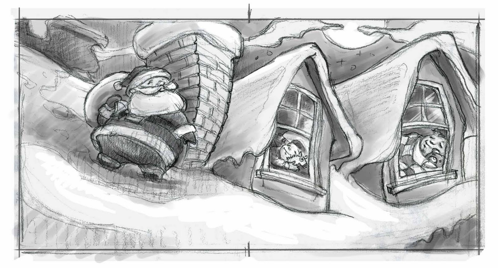
Pig Free Fall

Written by Beth Terrill- Pictures by Greg Newbold - 19" x 13", Acrylic

Plummeting toward the snow covered ground at breakneck speed, our poor piggy friend really has no time to execute the graceful acrobatic maneuvers I am sure he is capable of, but that's not the point. This picture was all about capturing the panic of a free fall while at the same time making the pig character lovable. I hope everyone who looks at this one laughs first and then says "oh no, poor piggie!". Like yesterday's post his picture also comes from "The Barnyard Night Before Christmas". It is a delightful Christmas story for young and old alike. Have a closer look here.

Thursday, September 16, 2010

Sheep Chase

Sheep Chase - 13" x 16" Acrylic

This picture comes from my book The Barnyard Night Before Christmas, here again demonstrating how things that you know and love can filter into your art and add authenticity to your work. As I mentioned yesterday, I grew up in a fairly rural setting and we had opportunities to care for animals including sheep and chickens. I think this familiarity helped me when depicting the characters in this book.This painting was one of a series of five from the book that were selected to appear in the prestigious Communication Arts Illustration Annual 49. This book as well as my other books can be purchased right here.

Wednesday, September 15, 2010

Winter Coats

Winter Coats - by Greg Newbold, 2008
 Oil on mounted canvas panel- 18 3/4" x 12"
Collection of Richard and Jan Newbold

Last night I fell asleep before I turned off the cooler. Big mistake.On hot nights we let it run hoping that by morning the house will be cool enough to withstand the heat of the day without becoming a sweatbox. That's one of the drawbacks of an older house with no central air ( but I also don't relish the thought of actually paying for central air so we make do with the swamp cooler).  Well this morning we were tempted to turn on the furnace, but resisted. Cold weather will be here soon enough, and I am just going to enjoy the mild fall weather. This particular painting is one I did last winter as part of my MFA thesis project. It is based on photos taken of the animals at our old family homestead. Our family all spent many years caring for the homestead and the animals there as my Great Aunt Mame had no children of her own. I have many fond memories of feeding and caring for the sheep and other animals there on frigid winter afternoons. My Aunt Jan felt the same and bought the painting as a Christmas present for my Uncle Richard last year (they can name several of the sheep in the picture, so it was very personal to them). I truly believe that the best art emerges from the things we know the best and love the most.

Tuesday, September 14, 2010

Lost Art Form

The Fruits of Our Labor

Yesterday I didn't paint, but I did practice art in the form of home canning. Not many people know how to make home preserves anymore and it's becoming a lost art.  I woke up yesterday and after my run, I picked an entire bushel of tomatoes out of our garden. We have been preserving our harvest every fall for years and yesterday was one of those days. I picked, scalded, peeled and filled the jars while my wife took care of the processing. We ended up with a dozen beautiful quart jars of home grown tomatoes to use them in soups and casseroles all winter long. Some might consider this too much work for the result, but if we ever had to rely on the garden and our home storage to survive, I am glad to know we could. If you have ever eaten a home canned pear compared to one from a grocery store can, you know what I am talking about.Delicious as opposed to dreck- my kids won't touch that crunchy flavorless excuse for fruit.

Monday, September 13, 2010

Grasshopper Thumbnail 2

Pencil with digital values added - 3 3/4" x 5 1/4"

Here's the sketch of the final spot illustration for Boys' Life fiction piece I mentioned a couple of posts ago. I got the go ahead on these, so I can start painting this week. The other two are more complex, so I need to gather more reference for those, but I will be getting this one on the board today.

Friday, September 10, 2010

I. F - Proverb

Grazing - 7" x 5" mixed media/acrylic

The grass is always greener on the other side of the fence- or so the proverb says. If you think this way, then either climb the fence or just get on with life on your side. I talk to my students a lot about only worrying what you can control and trying to be happy and and find the positive of whatever situation you find yourself in. Fear and negativity don't jive well with creativity and productivity. So be like this horse and enjoy the grass that's on your side of the fence... while you figure out how to get some from the other side as well.

Thursday, September 9, 2010

Grasshopper Thumbnail

Thumbnail sketch - 2 3/4" x 2" pencil with digital tone

Just got concept approval on a series of pictures I am doing for Scott Feaster at Boys' Life Magazine. The story is a fictionalized account of a young Lakota warrior who hones his skill with the bow and arrow to the point where he can hit grasshoppers in flight. He eventually grows up to become Chief Crazy Horse. This is the thumbnail sketch for the opening spread. I typically work this way as I prefer to work out the design and basic composition before I get to far into the process, especially before I shoot photos. Shooting photos first seems to result in less a dynamic feel to the pieces. This way I get the drama I want and I pose the models to match. Everyone seems excited about the direction this is going- including me. Now I need to do some more research to gather reference material, schedule a photo shoot, etc. I'll post more of this project as it goes along.

Wednesday, September 8, 2010

I. F - Dessert

Protein Shake- 6" x 10" mixed media/acrylic

OK, so I'm a little late on the Illustration Friday thing- whatever. This piece was part of an editorial series I did for Muscle and Fitness magazine. The article dealt with the issue of whether or not it was possible for a body builder or even a mere fitness fanatic to consume too much protein. So here's a guy protein loading a bit too much I think. You never know though, some guys might consider a shake like that "dessert". The art director was Michael Touna. He was great to work with and gave me some good leeway to mold his concept ideas into my style. Hey Tuna- if you're looking- give me some love!

Tuesday, September 7, 2010

Madame X

Madame X by John Singer Sargent

The painting that is commonly considered to be John Singer Sargent's masterpiece nearly caused his ruin before his career even had a chance to skyrocket. What even fewer people know is that it arguably did destroy the social status if not the entire life of it's subject, then twenty three year old Virginie Amelie Avegno Gautreau. Amelie Avegno was a New Orleans native of French descent who transplanted to Paris along with her widowed mother at about the same time a young American painter John Singer Sargent began to study art in the City of Lights. Sargent met the young socialite who had married a man nearly twice her age as a way to continue her climb in social status as well as for the financial security it brought. Sargent was smitten and immediately wanted to paint this girl that was considered a stunning beauty though her unusually pale complexion and rather prominent nose were not conventionally attractive. At the same time, rumors of Gautreau's moral improprieties also swirled about the Parisian social circles which would ultimately add fuel to the oncoming scandal. Sargent, trying to build upon the previous year's success at the Salon, spent the better part of a year doing studies and working on the nearly seven foot tall full length portrait.

The unfinished copy of Mrs Gautreau hangs in London's Tate Gallery

The painting depicts Mrs. Gautreau in a sleek black dress with jeweled shoulder straps, a look that is often imitated and now considered classic. Sargent labored over the painting and eventually began a second version of the portrait because he felt the original had become overworked and wanted a "fresh version" to hang at the 1884 Paris Salon. Sargent's friend and teacher Carolus-Duran convinced Sargent that the painting was indeed his best work and he ultimately exhibited the original.

An engraving of the portrait as it appeared in the 1884 Salon

When unveiled, the painting was met with scorn and ridicule. Sargent had misjudged the reaction to what he thought would be a bold and daring artistic move- painting a strap that had slipped from it's proper position atop Madame Gautreau's porcelain shoulder. Instead of praise and accolades, venomous tirades about the overtly sexual nature of the painting filled the Parisian papers. Not only was the painting and it's painter vilified, but much of the negative reaction was aimed squarely at the sitter. Criticisms like "vulgar" and "spineless", "monstrous" and "detestable" were leveled at Mrs. Gautreau herself. Reviews ran the gamut of negativity such as "the profile is pointed, the eye microscopic, the mouth imperceptible, the neck sinewy, the right arm lacks articulation, the hand is deboned. The decolletage of the bodice doesn't seem to make contact with the bust- it seems to flee any contact with the flesh." Another critic stated that "this portrait is simply offensive in it's insolent ugliness and defiance of every rule of art". Both the artist and subject were shocked at the negativity of the reception. Sargent, rather than pull the painting from the Salon, which would seem an acknowledgement of his failure, elected to let the painting hang for the duration of the show. Incensed by the public flaying of Amelie's looks and character, the Gautreaus refused to purchase the painting. The public opinion of Mrs. Gautreau plummeted and what was once one of Paris' most visible "it girls" became a mockery and a caricature of herself. Unable to bear the brunt of such shame, she eventually exiled herself from Parisian high society circles. Sargent, reputation damaged, retreated to the friendlier shores of England as well as his native America to repair his career to which he succeed brilliantly, though never again as daringly.

Madame X hung in Sargent's studio for decades after the disasterous1884 Salon

Sargent repainted the strap in it's proper position as we know it today and kept the portrait in his studio for the next three decades, eventually loaning it out to various shows where it finally received acclaim as one of the most exquisite portraits of the century. Sargent finally sold the painting to the Metropolitan Museum of Art in  1916 after the death of Amelie Gautreau. Whether out of respect for her memory or spite, the artist insisted the painting be thereafter known as "Madame X". The lasting fame that eluded Amelie Gautreau in life has been permanently erased as her image lives on anonymously in John Singer Sargent's masterpiece.

A more complete account of this saga can be read in Deborah Davis' compelling book "Strapless- John Singer Sargent and the Fall of Madame X" 

Monday, September 6, 2010

Swiss Days

This historic building in downtown Midway 
shows it's Swiss influence

On Friday I had a book signing at the annual Swiss Days celebration held in Midway, UT. The Festival began in the 1940's as a Harvest Days to celebrate fall and the bounties of the land. It later switched emphasis to a celebration of many of the immigrant's Swiss roots and became Swiss Days.


Detail of the Swiss clock that opens to 
pop out characters on the hour

Me signing my picture books at my friend Michelle Tanney's tent.

The two day festival features all sorts of performing arts, art, craft and food booths as well as a parade. This is the third consecutive year I have been invited to sign my books there at a friend's "Book Shoppe". I always enjoy getting out and talking with people and seeing how they respond to my work.

Friday, September 3, 2010

Oh, Sweet Revisions


Every once in a while, try as I might to avoid it. There comes a client who whether through fuzzy vision of their own concept or fuzzy communication of such, turns the studio upside down. In yesterday's post, I mentioned that getting the character of the farmer right on one particular box was, let's say a bit of a challenge. No worries, I am always up for an adventure, right? Or so I tell myself. When it boils right down to it, changes are a nuisance at best and at times degenerate in to a full blown nightmare. But the client is always right. After all, they hold the purse strings and I am not about to not get paid for my blood and sweat.

George next to a "Frankensteined" comp using pieces of several old paintings
No need to do a portrait, just a passing resemblance...


As John Ball of BDG put it, the concept was simple enough- create an illustration depicting a strong, iconic farmer that had an "oh so slight" passing resemblance to the owner of the company. Basically, we were looking for a rough caricature of the owner so that when people who knew "George" (we'll call him that because, well, that's his name) would think, wow, that looks a little like George
.
well, can you take out some wrinkles and make the nose smaller?


I took the photos I was given and came up with what I thought was a fair resemblance, not concerning myself much with a likeness, because that wasn't the objective.


First version of the painted face with new sketches and George for comparison

Yea, but can you change the angle of the face and make it look more like him?

Things were going great until others started putting their fingers in the pie and you all know how messy a pie can get when too many fingers are in it. Personally I prefer my pie with only my fingers in it. Sometimes I let a good creative director or designer stick in a thumb if they ask nice, but this situation quickly spiraled into a pie fight. I ended up doing several sketches and two full painted revisions of the face before finally satisfying the client- PHEW!.


2nd to last and final versions of the face
In the end, I took one of the actual photos  and painted over the top in Photoshop so that there would be little margin of error in the likeness (minus a few wrinkles and a slight rhinoplasty). I think deep down they wanted more George Clooney than the actual George, but in the end, everyone was happy because they got what they wanted and I got paid. And got paid again, and oh yea, again- I asked for a bit more dinero on each round of revisions because the portrait likeness was not part of the original agreement. Just goes to show you never get what you don't ask for and money makes those annoying changes feel oh so much better.

Thursday, September 2, 2010

More Produce Packages


Yesterday's post elicited a response from John Ball of BDG that included a bunch more examples of the packaging work that my illustration has been featured on.


I have done a combination of full color as well as line art pieces for John and it's always a fun challenge to take something as potentially dull as a cardboard box and make it lively and interesting.


This particular box has it's own story that I will have to save for another day. Let's just say that getting the character of the farmer right was a bit of a challenge. But hey, it's our job as illustrators to make the client happy, which in the end I believe I accomplished.

Wednesday, September 1, 2010

Tomato Time


The garden is running away from me this fall. Too much produce and not enough time to get it all into jars. Must find a few hours to take care of the tomatoes and help make pickles. I am grateful for the productivity though, and the garden has done as well as any in previous summers. I have had the chance to work on a number of packages and labels for produce growers through my associations with California agency Ball Design Group. John Ball is great to work with and it's always fun to be waltzing down the produce aisle of the local grocery store and see your work. This is a little thing I did a couple of years back that is still floating around in the stores. It made it's way onto boxes for a number of things including the tomatoes and peppers. I always do a little fist pump when I see it, even if it only printed two inches wide and nobody else really knows or cares.